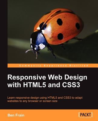
- Išsiųsime per 10–14 d.d.
- Autorius: Ben Frain
- Leidėjas: Packt Publishing
- Metai: 2012
- Puslapiai: 324
- ISBN-10: 1849693188
- ISBN-13: 9781849693189
- Formatas: 19.1 x 23.5 x 1.7 cm, minkšti viršeliai
- Kalba: Anglų
- Extra -15 % nuolaida šiai knygai su kodu: ENG15
Atsiliepimai
Aprašymas
Learn responsive design using HTML5 and CSS3 to adapt websites to any browser or screen size with this book and ebook.- Everything needed to code websites in HTML5 and CSS3 that are responsive to every device or screen size
- Learn the main new features of HTML5 and use CSS3's stunning new capabilities including animations, transitions and transformations
- Real world examples show how to progressively enhance a responsive design while providing fall backs for older browsers
In Detail
Tablets, smart phones and even televisions are being used increasingly to view the web. There's never been a greater range of screen sizes and associated user experiences to consider. Web pages built to be responsive provide the best possible version of their content to match the viewing devices of not just today's devices but tomorrow's too.
Learn how to design websites according to the new “responsive design” methodology, allowing a website to display beautifully on every screen size. Follow along, building and enhancing a responsive web design with HTML5 and CSS3. The book provides a practical understanding of these new technologies and techniques that are set to be the future of front-end web development.
Starting with a static Photoshop composite, create a website with HTML5 and CSS3 which is flexible depending on the viewer's screen size.
With HTML5, pages are leaner and more semantic. A fluid grid design and CSS3 media queries means designs can flex and adapt for any screen size. Beautiful backgrounds, box-shadows and animations will be added – all using the power, simplicity and flexibility of CSS3.
Responsive web design with HTML5 and CSS3 provides the necessary knowledge to ensure your projects won't just be built 'right' for today but also the future.
EXTRA 15 % nuolaida su kodu: ENG15
Akcija baigiasi už 6d.01:21:52
Nuolaidos kodas galioja perkant nuo 10 €. Nuolaidos nesumuojamos.

- Autorius: Ben Frain
- Leidėjas: Packt Publishing
- Metai: 2012
- Puslapiai: 324
- ISBN-10: 1849693188
- ISBN-13: 9781849693189
- Formatas: 19.1 x 23.5 x 1.7 cm, minkšti viršeliai
- Kalba: Anglų
- Everything needed to code websites in HTML5 and CSS3 that are responsive to every device or screen size
- Learn the main new features of HTML5 and use CSS3's stunning new capabilities including animations, transitions and transformations
- Real world examples show how to progressively enhance a responsive design while providing fall backs for older browsers
In Detail
Tablets, smart phones and even televisions are being used increasingly to view the web. There's never been a greater range of screen sizes and associated user experiences to consider. Web pages built to be responsive provide the best possible version of their content to match the viewing devices of not just today's devices but tomorrow's too.
Learn how to design websites according to the new “responsive design” methodology, allowing a website to display beautifully on every screen size. Follow along, building and enhancing a responsive web design with HTML5 and CSS3. The book provides a practical understanding of these new technologies and techniques that are set to be the future of front-end web development.
Starting with a static Photoshop composite, create a website with HTML5 and CSS3 which is flexible depending on the viewer's screen size.
With HTML5, pages are leaner and more semantic. A fluid grid design and CSS3 media queries means designs can flex and adapt for any screen size. Beautiful backgrounds, box-shadows and animations will be added – all using the power, simplicity and flexibility of CSS3.
Responsive web design with HTML5 and CSS3 provides the necessary knowledge to ensure your projects won't just be built 'right' for today but also the future.


Atsiliepimai